

LABESH
Rebranding and building a responsive e-commerce website
Role
Product Designer
Project Type
Responsive Web
Timeline
Dec 2021–Feb 2022
Labesh started back in 1995 as a clothing store targeting a budget-minded audience who looked for basics for any occasion. Labesh is Hebrew for “to be clothed”— tying back to the beginning in the Garden of Eden when God first clothed man and woman. They believe in the beauty of simplicity.
I was tasked to design a logo for the company that is modern and simple to reflect the company’s beliefs, as well as design a responsive e-commerce website that is easy to use and allows customers to browse through all products and filter by size, color, style, etc.

THE PROBLEM
Labesh is very successful offline. However, they are very late in the game of a digital transformation, while the opportunity for sales online is huge, so they are in need of a responsive e-commerce website. Their logo is also very outdated, so they are also in need of a new logo.
Understanding Our Users
COMPETITIVE ANALYSIS
To better understand the market and gather information on existing e-commerce experiences of similar brands, I conducted a competitive analysis to identify common trends amongst their websites. I identified Labesh's main competitors as brands that offer a variety of modern and affordable clothing for any occasion, such as H&M, Zara, Uniqlo, Nordstrom, and Everlane.

USER INTERVIEWS
The next step in my research process was to test my hypotheses, gain new insights into what users value in a clothing e-commerce websites, and understand common pain points in order to build the best possible experience. I conducted four user interviews to deeper understand customers’ motivations, needs, and pain points when shopping online. The target demographic was 18–35 year old, fashion forward young shoppers. After the interviews, I went back to the recordings to take notes on common themes.
In conclusion, all 4 participants were interested in fashion trends and wanted to conveniently purchase clothing that fit them properly with a good deal.
DEFINING THE AUDIENCE
I created a user persona based on the primary and secondary research I conducted to build user empathy.

Mapping Out Solutions
In order to create the best solutions possible to the main problems I wanted to solve, I first conducted some exercises such as card sorting, sitemaps, and user flows. These exercises helped me pinpoint the most important features of the wireframes that I wanted to focus on.
BUILDING THE NAVIGATION SYSTEM
From my research, I found that upon arriving on a clothes website homepage, most participants immediately went to the search bar or navigation menu to browse or find an item that they had in mind.
To better understand how users expect clothing items to be sorted and categorized, I conducted a card sorting exercise on Optimal Sort with 10 participants and then created a sitemap to plan the global navigation system.

USER FLOW
Based on my research and persona, I created a user flow that shows how a user would flow through and navigate the website.

LO-FI WIREFRAMES
I sketched out and digitalized low fidelity wireframes, making sure I included priority features after understanding common design patterns and features that e-commerce websites shared.


Branding
I created a logo for Labesh that was minimal, clean, and modern to reflect the brand, along with other necessary UI elements to include in the high-fidelity wireframes.


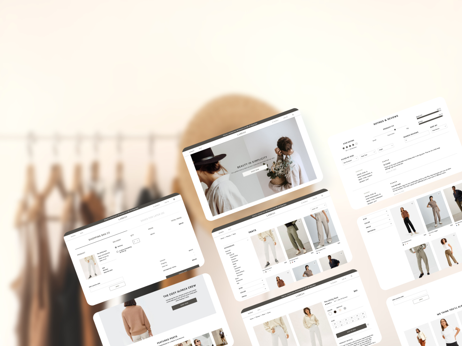
The Prototype
After defining how I wanted to style the website, I translated the vision to my high fidelity wireframes on Figma. This is where my designs really came to life!

Putting it to the Test
The last step was putting my prototype to the test and gathering user feedback. I conducted a test with four participants over Zoom and had them screen share to accomplish the following goals:
Gather data on first impressions of the website and the brand image
Verify that all web pages used in the testing process are intuitive and easy to use
Discover pain points and room for improvement
I tested this through three scenarios:
Scenario 1: You and your friends planned a beach vacation! You’re already planning your outfit and you decide you need a pair of white pants to complete your outfit. Walk me through what you would do and the process you’d take.
Scenario 2: You’ve been browsing for a while and this pair of white utility pants are calling your name. High waisted, slightly cropped, and a relaxed fit. You want to decide whether you want to buy it or not. Show me what you would do.
Scenario 3: You decided that this is what you want. What’s your next step to complete the purchase?

LESSONS LEARNED + NEXT STEPS
I created an affinity map and mapped out the successes, pain points, and suggestions from the feedback I received from the usability test to help me visualize what I need to prioritize in terms of revisions.

PRIORITY REVISIONS
Based on the feedback I received and the affinity map I made, I revised my prototype and added a quick view option and a bar that shows the progress of free shipping.